Cutting edge ‘smart’ templates that adapt automatically to fit the channel.
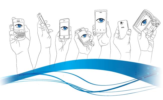
Responsive design
Responsive design is the next evolution in fluid or ‘elastic’ templates that adapt to the form factor of the browser you’re using. Taking advantage of the latest CSS features such as media queries, adaptive templates that not only fill the screen real estate efficiently, but also change their layout and content to suit the user’s needs. All without resorting to browser hacks or complex JavaScript code.
This very site uses this technique to seamlessly adapt whatever device you’re using. Try it now, by resizing the browser, or if you’re on a phone or tablet, by rotating the device.
Coming soon, Steely Eye’s set of ready to skin templates for use with the Multichannel platform, featuring Responsive design and app-like experiences in the browser, for:
eCommerce
Newspapers and magazines
Product Showcase
Video on Demand
Social apps